The Phoenix Project
The Phoenix Project: Creating Authentic Community Organisation Branding for Brierley Hill
When it comes to community organisation branding, authenticity isn’t just important – it’s everything. The Phoenix Project, a community organisation devoted to celebrating the people and history of Brierley Hill, needed more than just a logo. They needed an identity that would make their community proud to stand behind and support their mission.
Frank Chamberlain, Cultural Consortium Coordinator at The Phoenix Project approached us when we moved into Brierley Hill. Rather than a formal pitch meeting, Frank took us on a walking tour of the high street, sharing points of local interest and explaining what he and the consortium were trying to achieve for their beloved community.
The Phoenix Project is a community organisation dedicated to organising events that celebrate both the people and rich heritage of Brierley Hill. Their mission extends beyond simple event planning – they’re working to strengthen community bonds and preserve local history for future generations.

The Challenge:
The Phoenix Project faced a fundamental challenge common to many grassroots organisations: they existed as just a name. Without any visual identity or community organisation branding, they struggled with visibility and recognition. As Frank explained, branding was crucial for giving people something to be proud of – something they wouldn’t mind standing behind and supporting.
Their objectives were comprehensive: increase event attendance, build community pride, attract volunteers, secure funding, and establish credibility within Brierley Hill and the broader Black Country region. The target audience was equally broad, encompassing local residents of all ages, families, history enthusiasts, local businesses, and community leaders.
Our Approach:
Having lived in Brierley Hill for a combined 80 years, the founders of Eighty3 Design brought invaluable local knowledge to this community organisation branding project. We understood the area intimately, and more importantly, we understood the people.
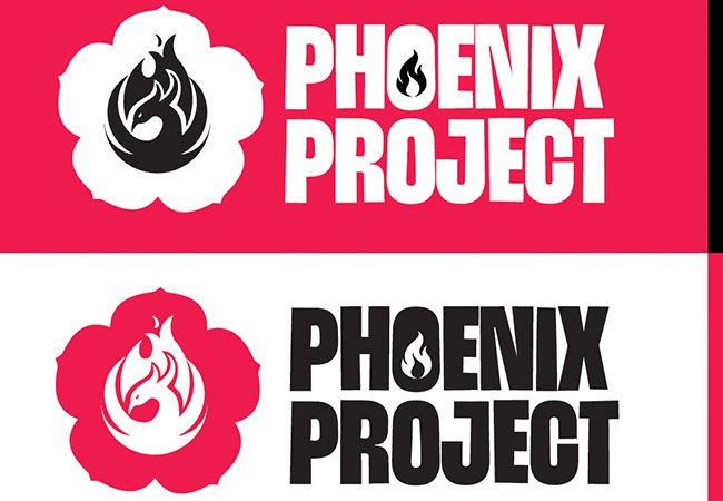
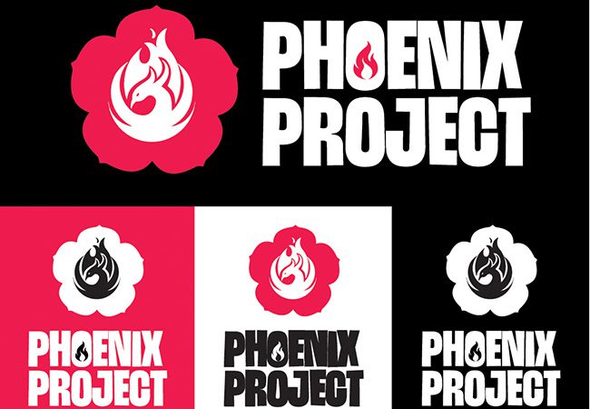
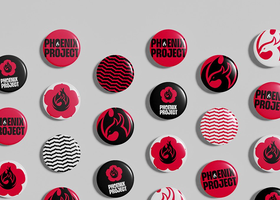
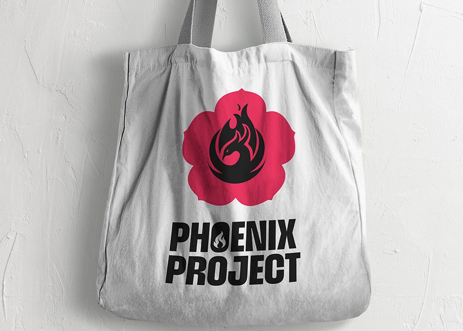
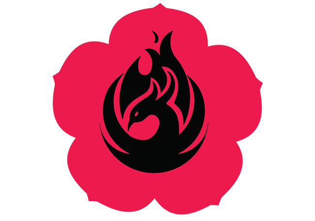
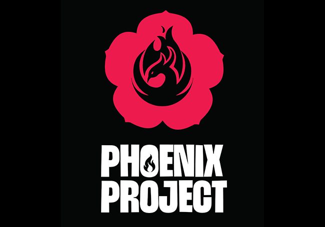
The brief was beautifully specific yet challenging: incorporate the Brier Rose (which gives Brierley Hill its name) and a phoenix emblem, whilst honouring the area’s industrial heritage through black and red—colours that reflect when Brierley Hill was “Black by day, red by night” during the industrial revolution. These colours also feature prominently on the Black Country Flag. The design needed to be simple and striking.
Our design process began with extensive research into Brier Rose imagery. We photographed and sketched various petals until we found the perfect form, which we then repeated radially to create the foundational rose shape.
The phoenix presented a unique challenge in community organisation branding. Most phoenix imagery falls into two extremes: overly ornate or heavily stylised. We needed something that felt approachable yet meaningful and authentic to the Black Country spirit. After exploring various inspirations, we developed a phoenix that struck the perfect balance, placing it thoughtfully within the brier rose framework.
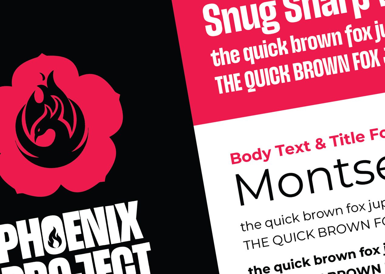
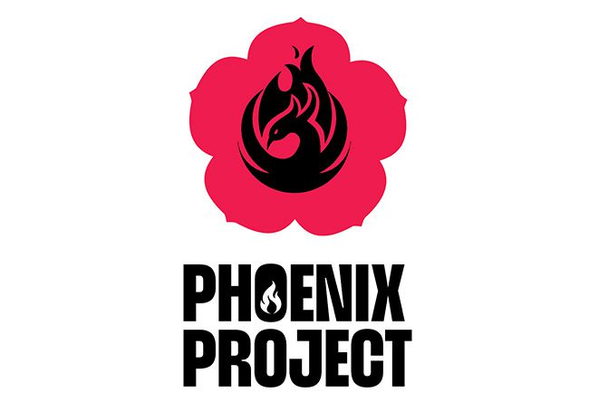
Typography played a crucial role in making the brand accessible. We selected a bold yet relaxed typeface with an almost comic-style quality that felt welcoming rather than institutional. The masterstroke was removing the centre of the ‘o’ and replacing it with a flame, a subtle detail that reinforced the phoenix symbolism whilst adding visual interest.
Services We Delivered
The Results:
The Phoenix Project faced a fundamental challenge common to many grassroots organisations: they existed as just a name. Without any visual identity or community organisation branding, they struggled with visibility and recognition. As Frank explained, branding was crucial for giving people something to be proud of – something they wouldn’t mind standing behind and supporting.
Their objectives were comprehensive: increase event attendance, build community pride, attract volunteers, secure funding, and establish credibility within Brierley Hill and the broader Black Country region. The target audience was equally broad, encompassing local residents of all ages, families, history enthusiasts, local businesses, and community leaders.
Client testimonial:
Working with the team at Eighty3 Design is always beneficial to all involved. They are happy to and talented at absorbing and growing our ideas while also being happy to share their own experience to the benefit of a project.
More than just a company, they are a node on a fertile local network of groups who work collaboratively and nurture each other’s growth. Eighty3 understand both business and benevolence and how to create opportunity for others through genuine kindness and curiosity.
They lead the way here in the work we do with young children and education. The novel and colourful approach they bring, attracts attention from children in primary through to college-age education. It is always fun to work with them and this is one of the most important keys we use to open new doors.
In one word I would sum them up as helpful. I always know when I pick up the phone, who ever answers, they will help.
Frank Chamberlain
Cultural Consortium Coordinator
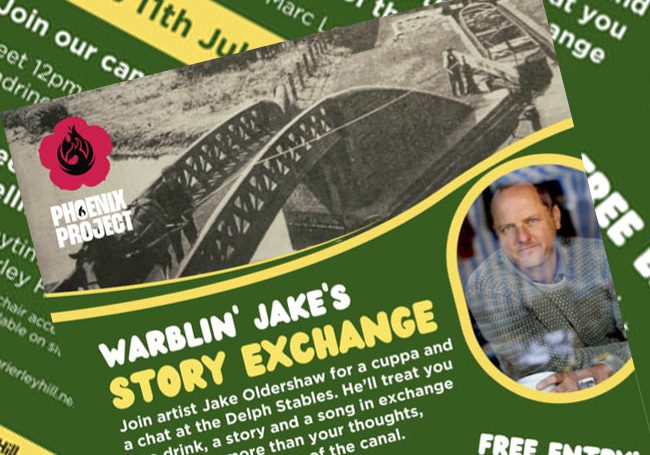
This project perfectly illustrates why local knowledge is invaluable in community organisation branding. Understanding Brierley Hill’s history, culture, and people gave us insights that no amount of research could replace. Black Country people don’t appreciate being patronised and can spot inauthentic messaging immediately. Our genuine connection to the area and belief in The Phoenix Project’s mission created the foundation for truly effective branding.
The alignment of values between agency and client proved crucial. We believed wholeheartedly in what they were doing, and they trusted us to deliver their vision. This mutual respect allowed for the creative freedom that resulted in such a successful outcome.
The devil truly is in the detail – from the flame in the ‘o’ to the carefully balanced phoenix design – and these thoughtful touches are what transform good community organisation branding into something genuinely meaningful and memorable.
Ready to create Your Community's Identity?
Whether you’re a community organisation, heritage group, local business, or any organisation looking for branding that goes the extra mile, we’d love to discuss your project. At Eighty3 Design, we believe in creating identities that don’t just look good – they mean something.
Contact us today to discover how authentic, locally-informed branding can exceed your expectations and make your community proud.

