The Association of Healthcare Cleaning Professionals
Elevating Professional Standards: A Collaborative Rebrand and Website Development
The Association of Healthcare Cleaning Professionals (AHCP) stands as a distinguished organisation within the healthcare cleaning sector, representing both individual cleaning professionals and healthcare facilities across the UK. With a reputation built over five decades of dedicated service to their members, AHCP takes their position and responsibilities seriously, maintaining high standards within this critical area of healthcare support.
As they approached their 50th anniversary milestone, AHCP recognised the need for a comprehensive rebrand and website development project that would reflect their professional standing and better serve their diverse membership base.

The Challenge:
When Matthew Rea, National Secretary at AHCP, approached Eighty3 Design through a referral from an existing client, the challenges were clear. The association’s existing brand identity was failing to represent their distinguished position in the marketplace. The pink colour scheme didn’t resonate with the organisation’s professional aspirations, whilst the logo lacked meaningful connection to their mission and values.
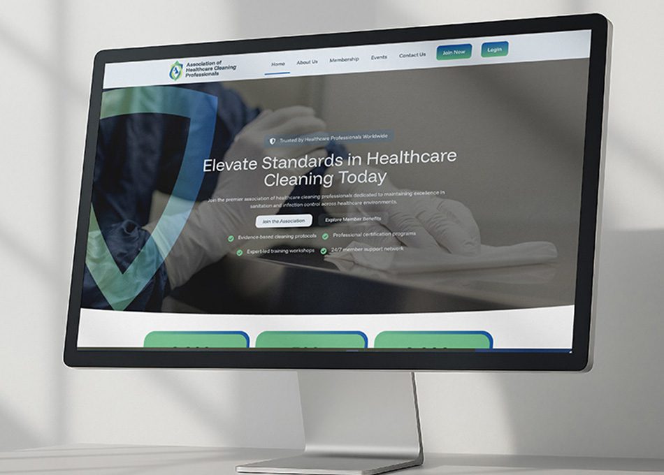
Perhaps more critically, their website had become a barrier rather than a tool. The clunky, difficult-to-update platform wasn’t serving their members effectively, and with such a varied user base in terms of digital skills, accessibility was paramount. AHCP needed their website to function as more than just a digital shopfront. They wanted a comprehensive platform that would genuinely enhance member value and facilitate better communication between branches and individuals.
The timeline added another layer of complexity. With the 50th anniversary celebration on the horizon, the entire rebrand and website development needed to be completed in under six weeks. This was a tight deadline that would test both creative and technical capabilities.
Our Approach:
Understanding that working with a committee can often present challenges, we began with face-to-face meetings with Matthew to establish a strong foundation and clear understanding of AHCP’s vision. This initial relationship-building proved crucial when we later presented our concepts to the full committee.
Our research phase involved studying other national organisations to understand the visual language that conveys authority and professionalism. However, we were determined to look beyond surface-level solutions. Whilst it might have been tempting to include obvious cleaning imagery like mops or buckets, this approach would have undermined the association’s professional standing rather than elevating it.
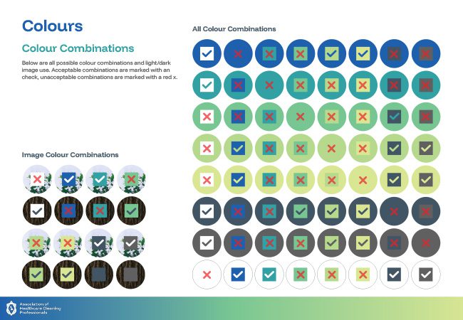
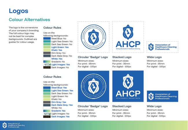
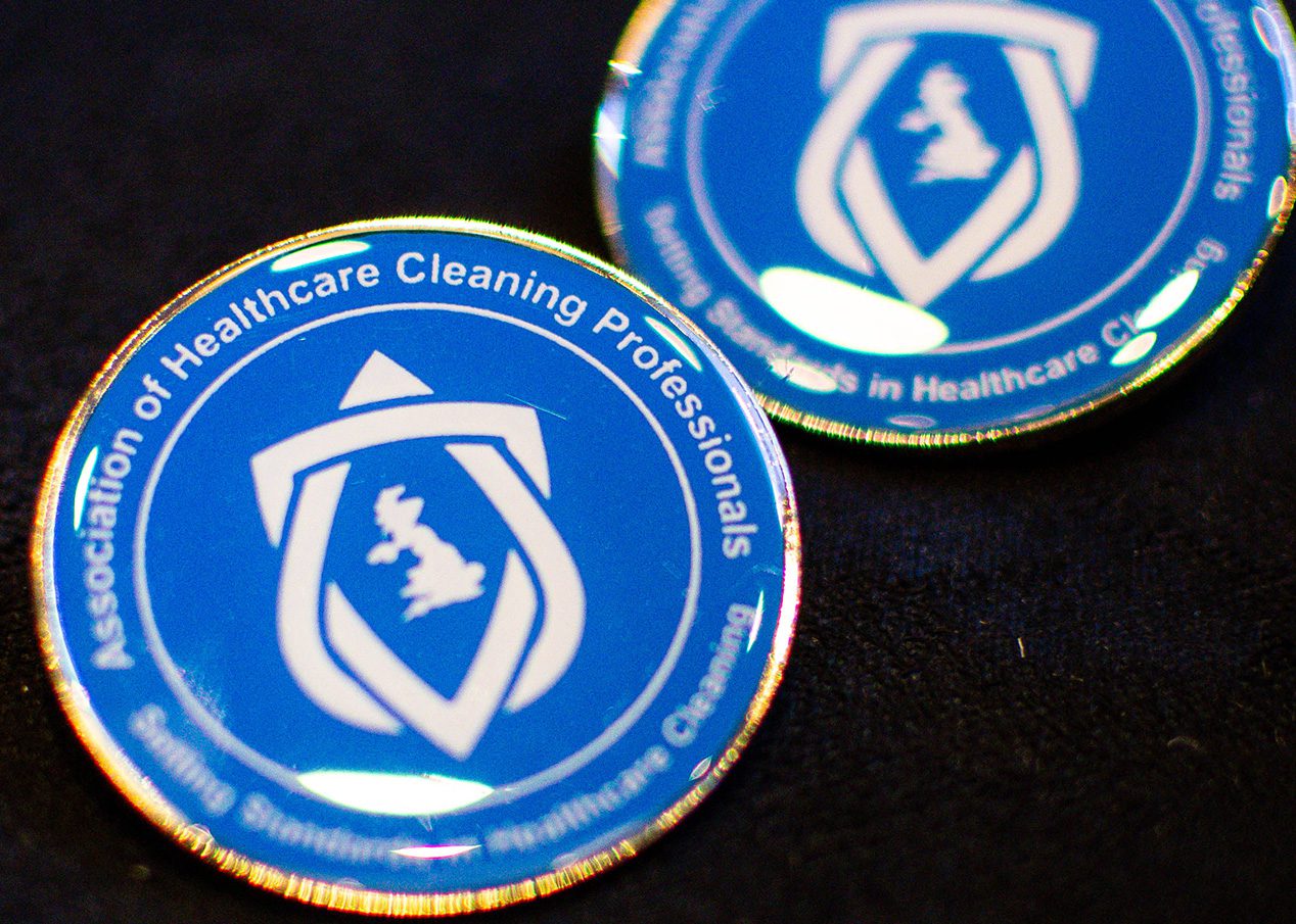
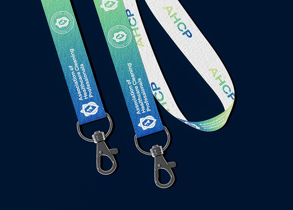
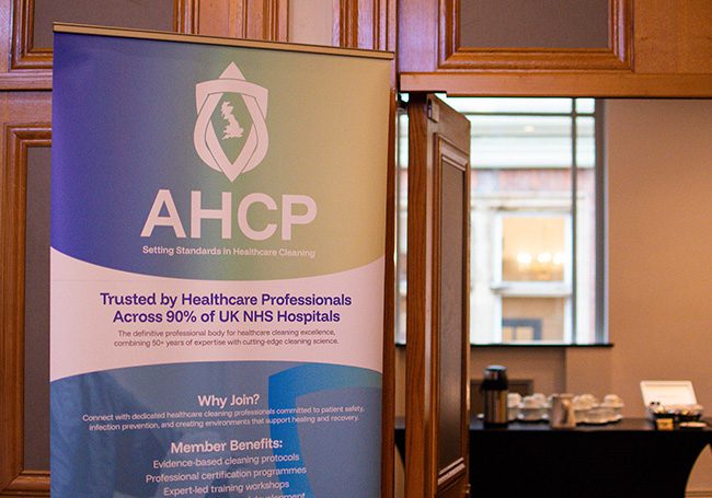
The collaborative nature of this rebrand and website development project became one of its greatest strengths. When the committee suggested incorporating the UK into the centre of our proposed logo design, our initial hesitation quickly gave way to recognition of their insight. This suggestion, along with their request to use NHS blue in the colour gradient, demonstrated the value of genuine collaboration in the design process.
Services We Delivered
The Results:
When Matthew Rea, National Secretary at AHCP, approached Eighty3 Design through a referral from an existing client, the challenges were clear. The association’s existing brand identity was failing to represent their distinguished position in the marketplace. The pink colour scheme didn’t resonate with the organisation’s professional aspirations, whilst the logo lacked meaningful connection to their mission and values.
Perhaps more critically, their website had become a barrier rather than a tool. The clunky, difficult-to-update platform wasn’t serving their members effectively, and with such a varied user base in terms of digital skills, accessibility was paramount. AHCP needed their website to function as more than just a digital shopfront. They wanted a comprehensive platform that would genuinely enhance member value and facilitate better communication between branches and individuals.
The timeline added another layer of complexity. With the 50th anniversary celebration on the horizon, the entire rebrand and website development needed to be completed in under six weeks. This was a tight deadline that would test both creative and technical capabilities.


Client testimonial:
I just wanted to say thank you for all the hard work that you and team have put in to help launch the website!
Matthew Rea
National Secretary
The Association of Healthcare Cleaning Professionals
This rebrand and website development project reinforces several crucial principles we hold dear at Eighty3 Design. Firstly, the importance of moving beyond obvious visual metaphors to create meaningful, sophisticated brand identities that elevate rather than limit an organisation’s potential.
Secondly, the value of genuine collaboration cannot be overstated. The committee’s suggestions, particularly incorporating the UK and using NHS blue, ultimately strengthened the design significantly. Sometimes the best creative solutions emerge when client insights meet design expertise.
Most importantly, this project demonstrates that websites should work as active business tools, not passive digital brochures. When properly developed, a website becomes an extension of your organisation’s capability, enhancing member value and streamlining operations simultaneously.
The six-week timeline proved that ambitious deadlines need not compromise quality when clear communication, collaborative decision-making, and focused execution align effectively.
Ready to Transform Your Organisation's Impact?
If your organisation needs a rebrand and website development project that goes beyond surface aesthetics to deliver genuine business value, we’d love to explore how we can help. Whether you’re approaching a significant milestone or simply recognising that your current brand and digital presence aren’t serving your mission effectively, transformation is possible.
Contact Eighty3 Design today to discuss how collaborative design thinking can elevate your organisation’s professional impact.

