Logo Design - Branding - VISUAL IDENTITY
BUILDING CREDIBILITY FROM DAY ONE
Startup Branding That Competes with Industry Leaders
Leoclad Supplies will launch in 2026 to serve the roofing and cladding industry with comprehensive product solutions. Director Tom Sinar needs his new business to stand alongside established competitors from day one, competing for contracts with construction companies who typically favour suppliers they already know and trust. Without brand recognition in a sector dominated by longstanding relationships, Tom needs startup branding that will open doors and give him the platform to demonstrate his expertise.
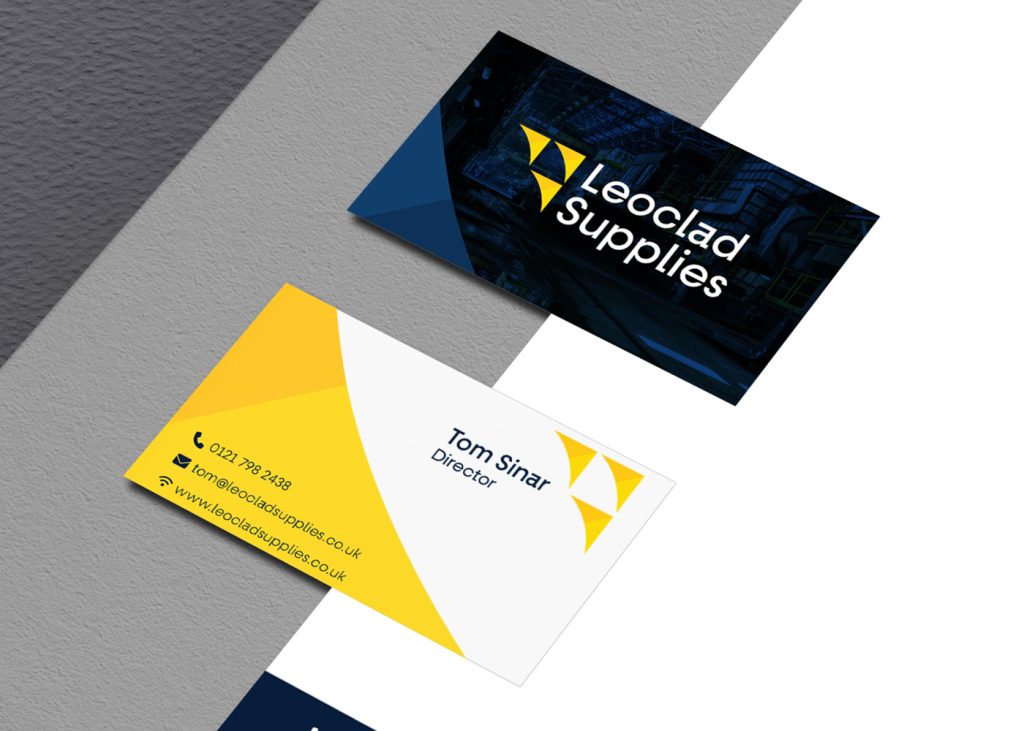
The brief was straightforward but challenging: create a brand identity that looked as established and credible as companies that had been trading for decades. Tom wanted potential clients to see Leoclad’s business card, website or vehicle livery and immediately perceive a professional operation capable of handling their roofing supply requirements. The startup branding needed to work across every touchpoint, from digital platforms to printed materials, establishing Leoclad as a serious player in an industry where reputation means everything.
Need Startup Branding That Opens Doors?
Our Approach to Professional Startup Branding
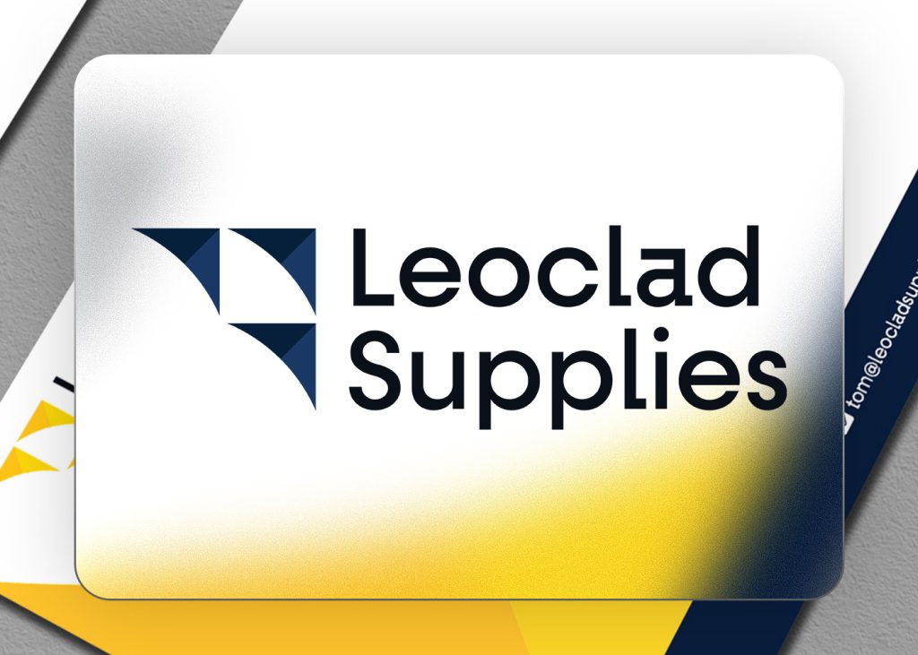
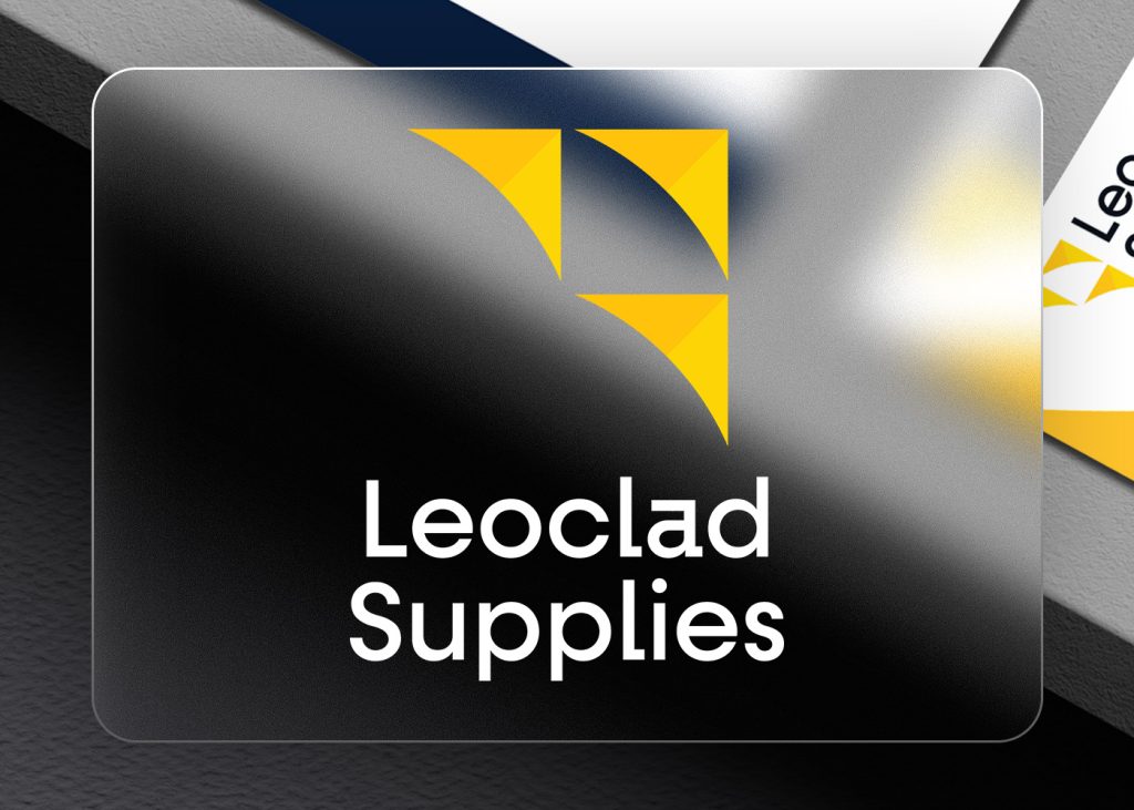
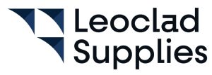
We built Leoclad’s startup branding around a geometric icon system that serves multiple purposes. The three triangular forms create a bold, memorable mark that immediately registers as roofing-related while remaining abstract enough to work across different applications. More importantly, the design represents Tom and his young family moving forward and upward together, reflecting the personal drive behind the business. This combination of industry relevance and personal meaning gave the brand an authentic foundation that goes beyond generic corporate imagery.
The colour strategy balanced professional credibility with market differentiation. Navy blue anchors the brand with the trust and stability essential for a supplies company, while golden yellow injects energy and positions Leoclad as forward-thinking rather than conservative. This complementary colour relationship performs exceptionally well across all media, from digital screens to printed stationery, and maintains strong accessibility standards with contrast ratios exceeding WCAG requirements. The palette distinguishes Leoclad from competitors who rely heavily on blues and greys while maintaining the professional authority the startup branding required.
Typography adds another layer of distinction to the startup branding. We selected a clean sans-serif with subtle design features that elevate it beyond standard corporate fonts. Sharp 90-degree edges on characters like the lowercase ‘a’ and ‘l’ create visual interest and demonstrate attention to detail, reinforcing Leoclad’s commitment to quality without sacrificing legibility. The typeface maintains clarity at every scale, from business cards to vehicle graphics. We developed the brand across stationery, digital templates and marketing materials, creating a consistent visual language that presents Leoclad as an established operation from first contact. The result is startup branding that gives Tom the credibility to compete for business, allowing his industry knowledge and service quality to do the rest.