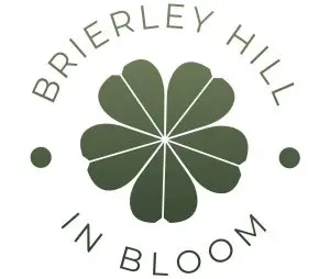
Working closely with the group, we started where all good identities start, with what makes them them. The answer was obvious the moment we talked it through together: flowers, community and a real sense of place. From there we designed a simple, confident flower mark made up of eight petals radiating from a single centre point, a quiet nod to many hands coming together to make something grow. We deliberately avoided anything fussy or over-illustrated. A volunteer group logo has to earn its keep in the real world, on tote bags, stickers, hi-vis vests and social media posts, and often at small sizes or in a single colour, so the mark needed to be bold, clean and instantly readable. It works at any size, from a website favicon to the side of a planter.
Around the flower, we set the group’s name in elegant, generously spaced capitals, curving the type to form a circular badge, with a small dot on either side to complete the composition. The typography gives the identity a polished, established feel, quite deliberately so. Community projects are sometimes dismissed as small or amateur, and we wanted the opposite impression: a group that takes its work seriously and deserves to be taken seriously in return, whether that is by residents, the local council or a prospective sponsor. The badge format also makes the identity endlessly usable, sitting comfortably on everything from window stickers to event banners without ever needing to be redrawn.
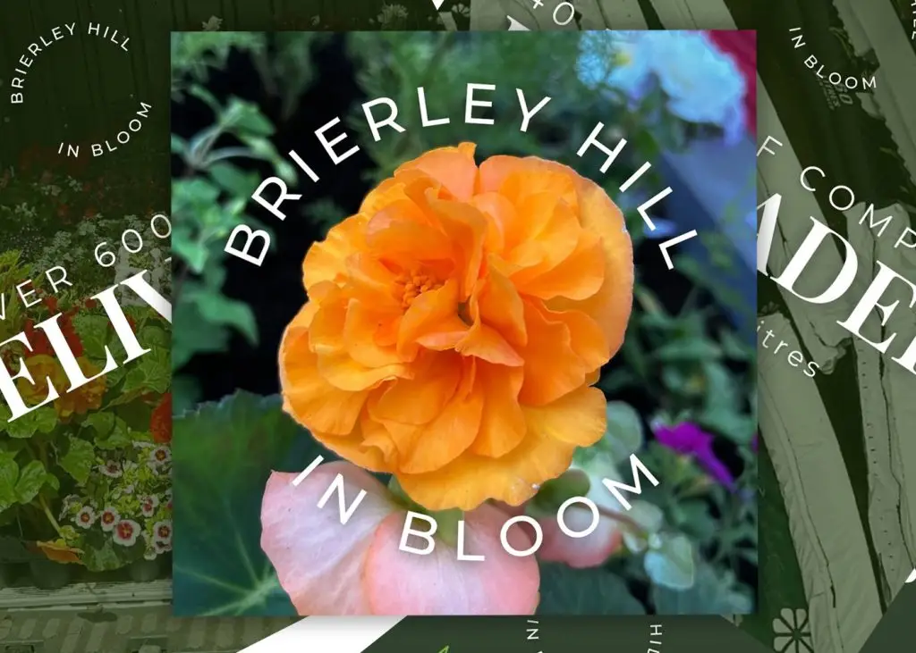
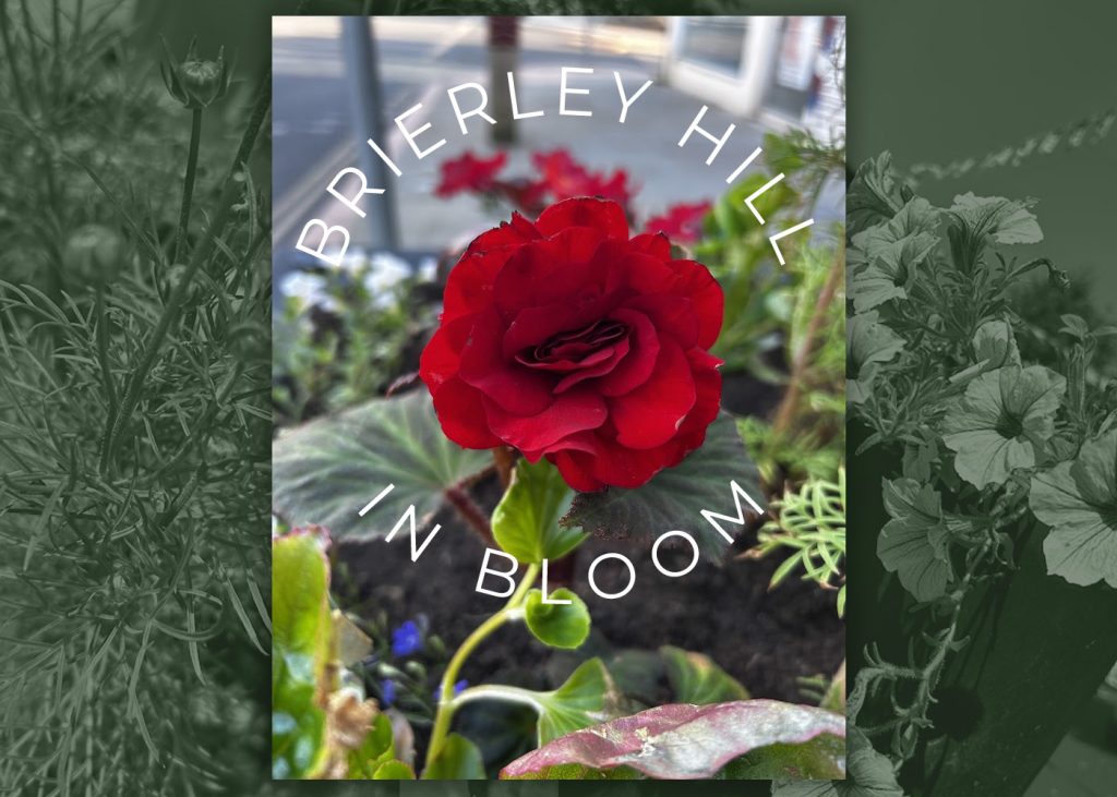
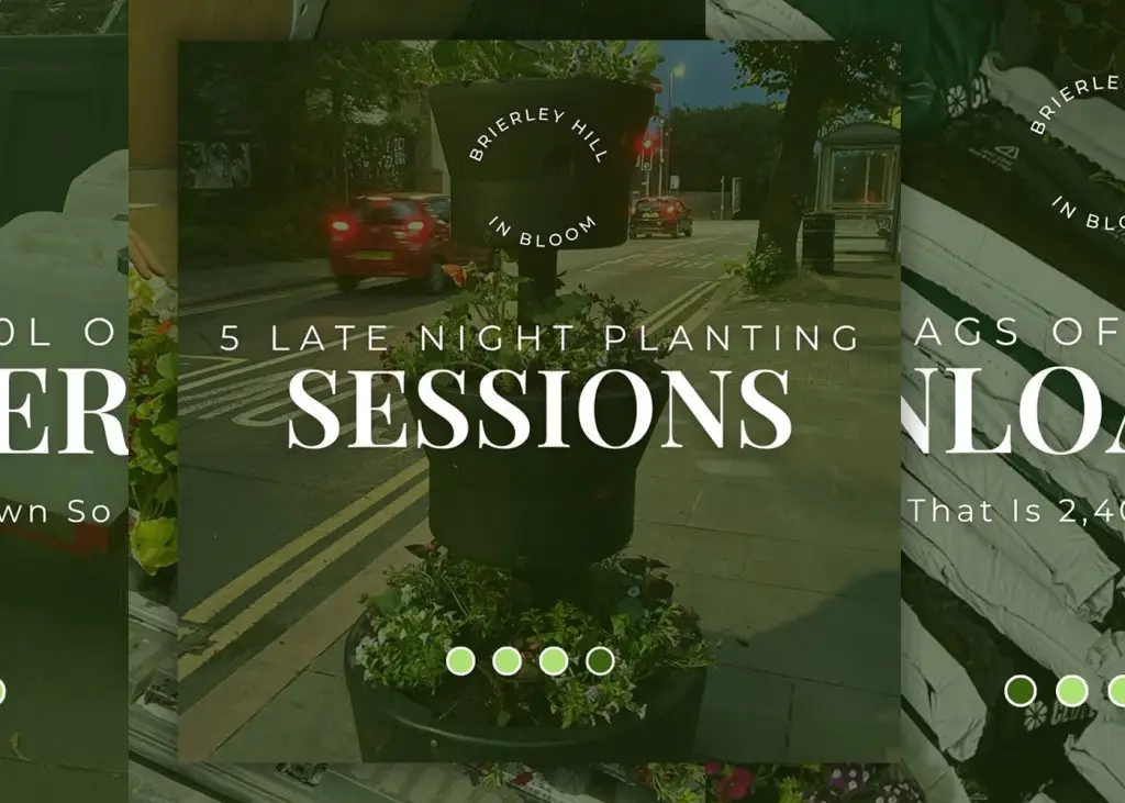
For colour, we kept things rooted in nature with a rich botanical green, subtly graduating in tone to give the flower depth and life. Alongside it, we created a clean white version of the logo, which sits beautifully over the group’s own photography of the planters in full bloom. That version has quickly become the star of the show on social media, framing bright begonias and petunias without ever competing with them. Seeing the finished mark layered over those photographs was the moment it all clicked: an identity that lets the flowers do the talking, while giving the volunteers behind them a name and a face the whole town can recognise. We cannot wait to see it popping up along the high street.